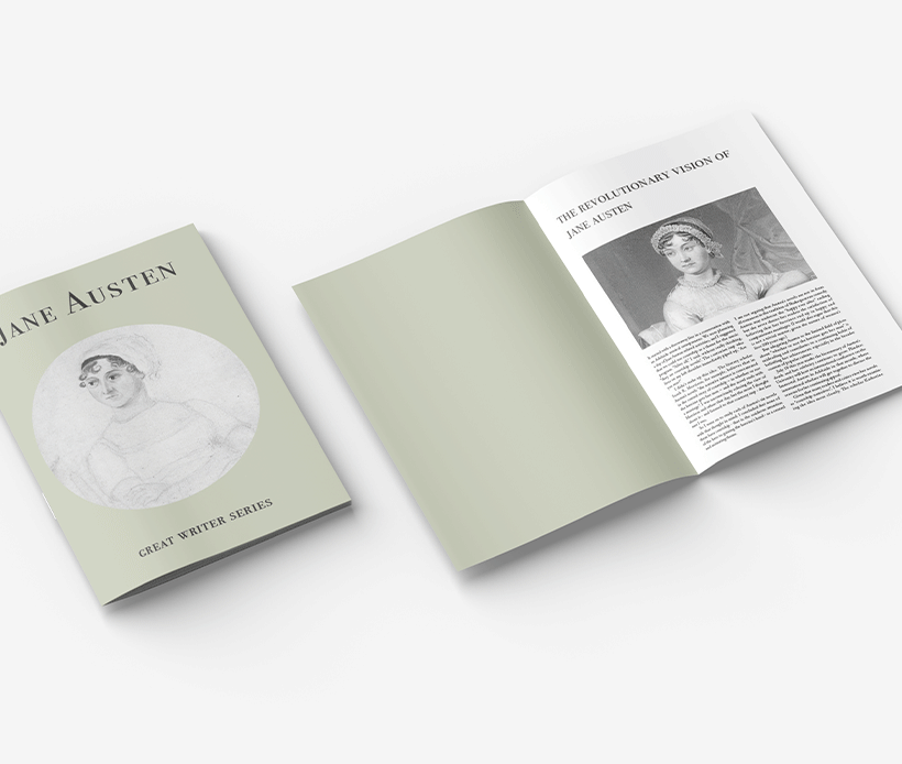
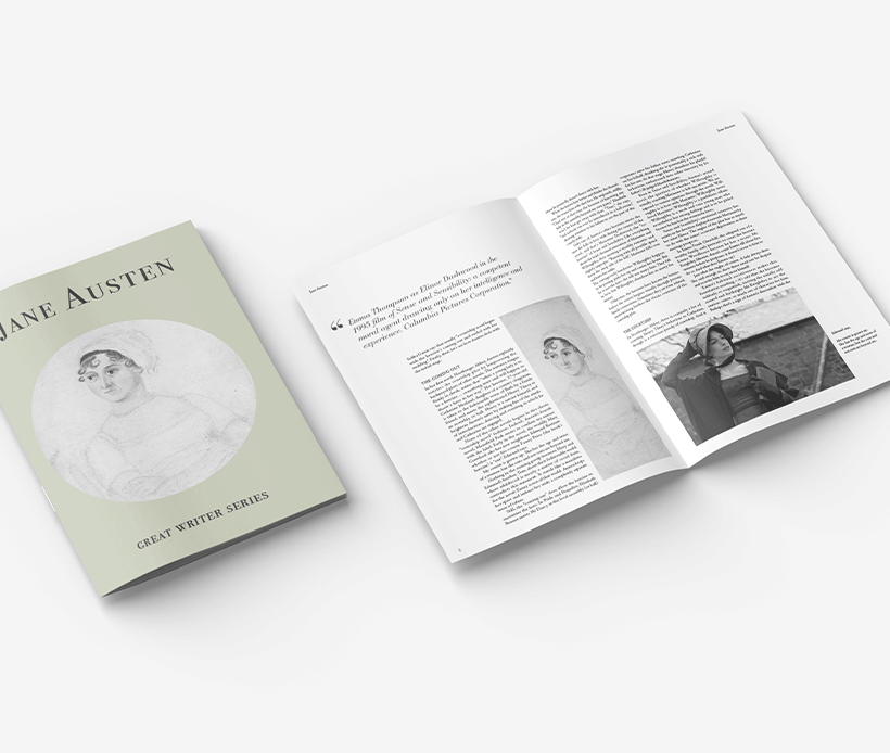
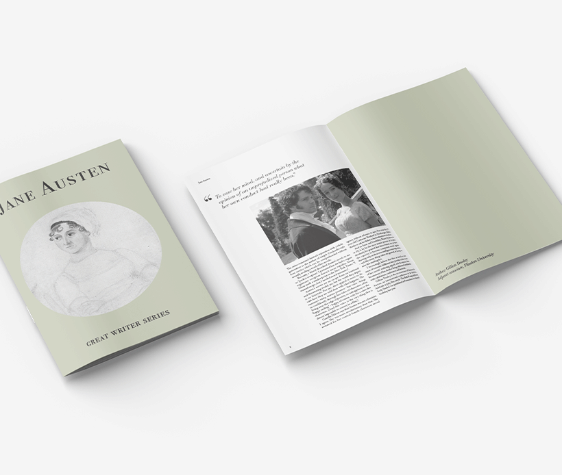
GREAT WRITER SERIES ——
INTRODUCTION
This is a magazine design project. The content of the magazine is an essay on Jane Austen, and the pictures are pictures I picked from the Internet, including portraits of Jane Austen, photos of her novels and the pictures from the film Pride and Prejudice. The typography design of the magazine content strictly follows the grid system. And for the fonts, I also choose the classic serif. The cover is a classic and elegant grey-green, with a round portrait as decoration. Very much in line with Jane Austen's elegance and the 18th century she was in at the time.
LAYOUT SKETCH
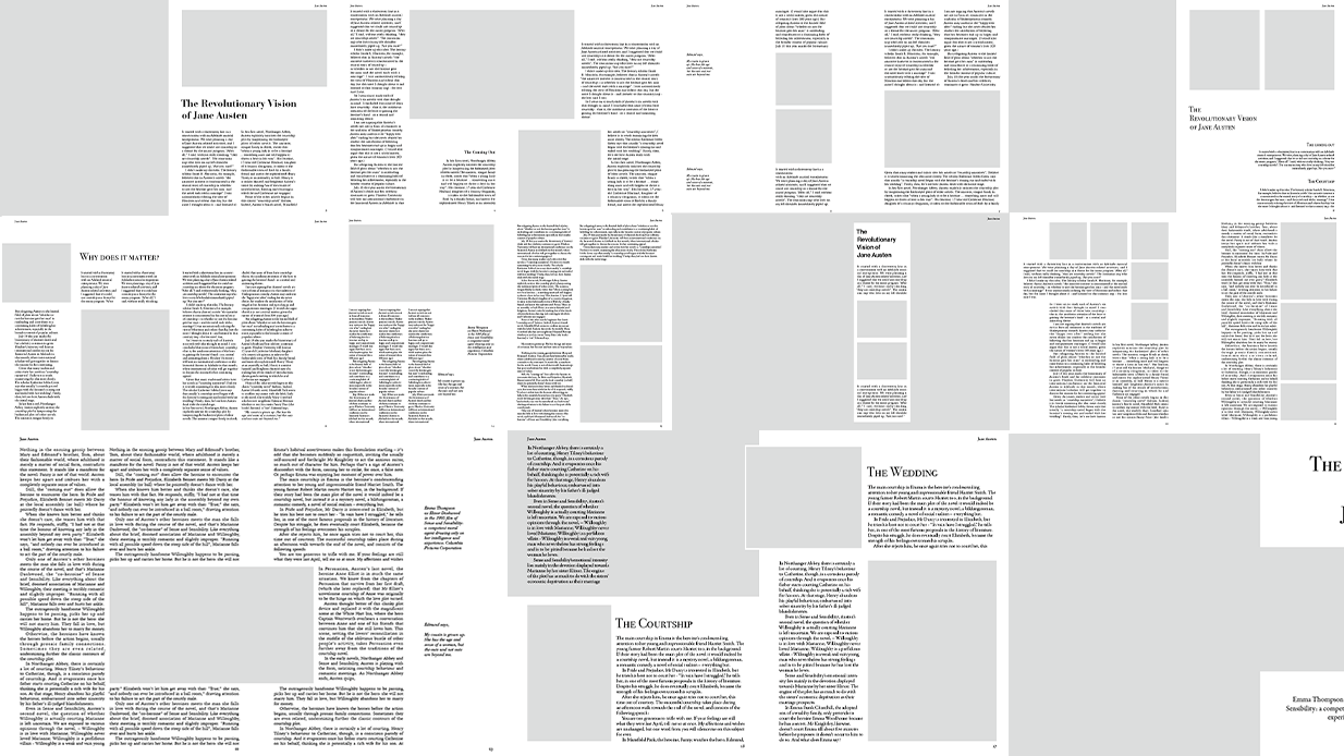
This is the layout sketch of the text and pictures inside the magazine. Each page of the sketch is strictly consistent with the grid system.
COVER SKETCH
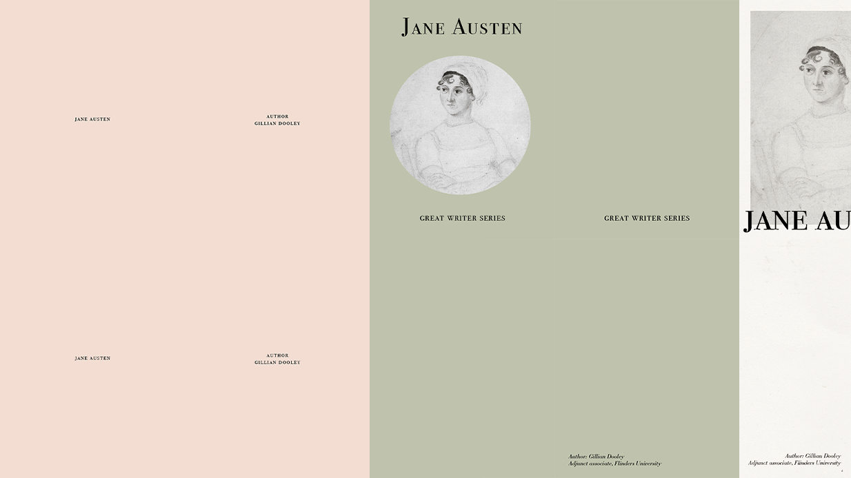
This is a sketch I made when I was designing the cover. In terms of colors, I chose classic and elegant low-saturation colors.